This article is to help aid in designing digital billboard content that is visually captivating and effective in delivering a clear message.
We recommend following these important best practices when creating advertisement artwork:
COLORS
Contrasting color combinations work best. Stay away from light or white backgrounds.

TEXTS & FONTS
Outdoor designs should be simple and easy to read. Make text large! Always use “sans serif” fonts. Avoid decorative, italic, or serif fonts.

IMAGES
Use one single image. When using images, take a small object and make it large (a watch) rather than a large object small (a cityscape).

MESSAGE
Try to keep it under ten words total on the entire screen.

SPECIFICATIONS
Screen sizes are always measured in pixels.
DESIGNING FOR LARGE FORMAT BILLBOARDS
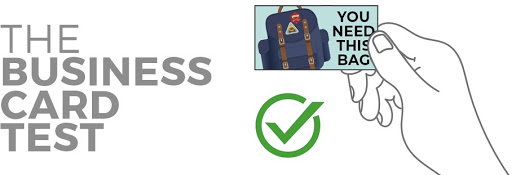
If your billboard ad was printed on a business card and held out at arm’s length, could you read it?
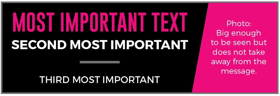
Prioritize copy with size, position, and color. Cut the wording down to as little as possible. Using a bright color can draw the viewer’s eye to the ad.
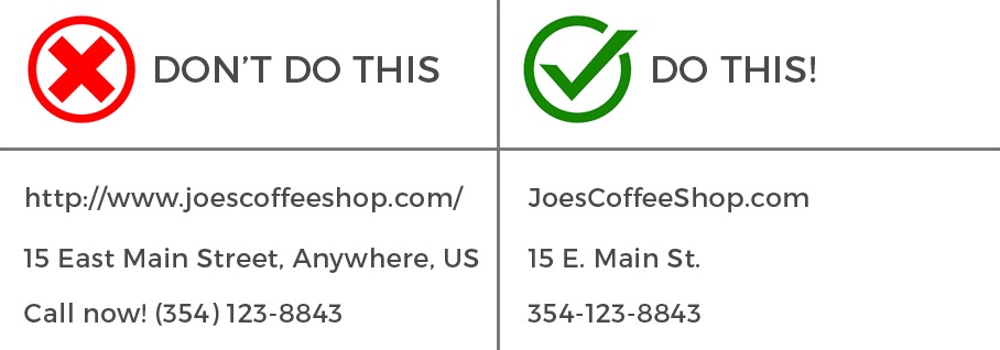
If displaying a website, leave off the www as it is not necessary and only takes up valuable space. Also, capitalizing the words in the web address can make it easier to read. Example: JoesCoffeeShop.com
DIGITAL ONLINE ADS VS. DIGITAL OUT OF HOME
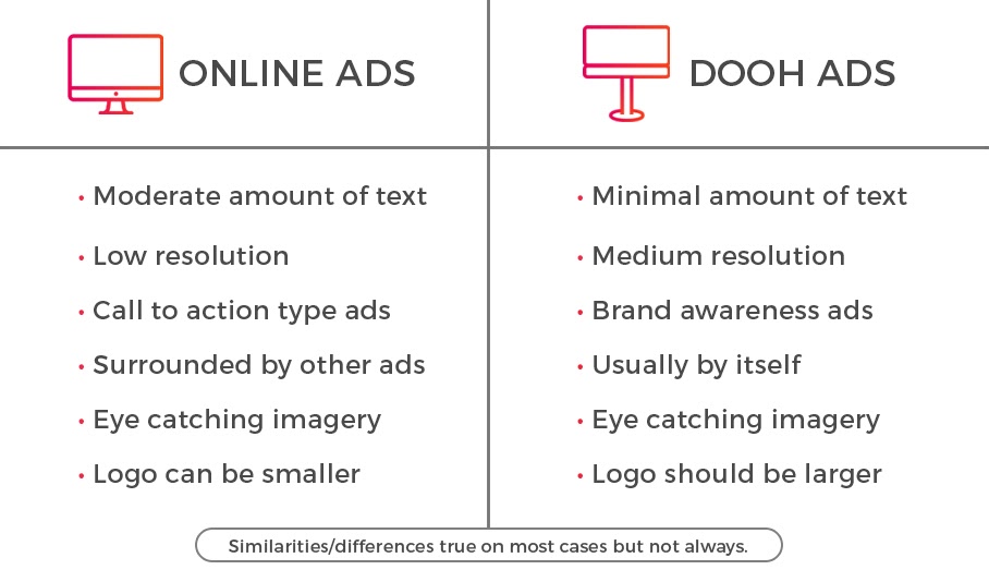
A good online ad doesn’t necessarily make a good billboard ad and vice versa. An online ad can have more information/wording as a billboard but needs to be more eye-catching as it is often surrounded by other ads.
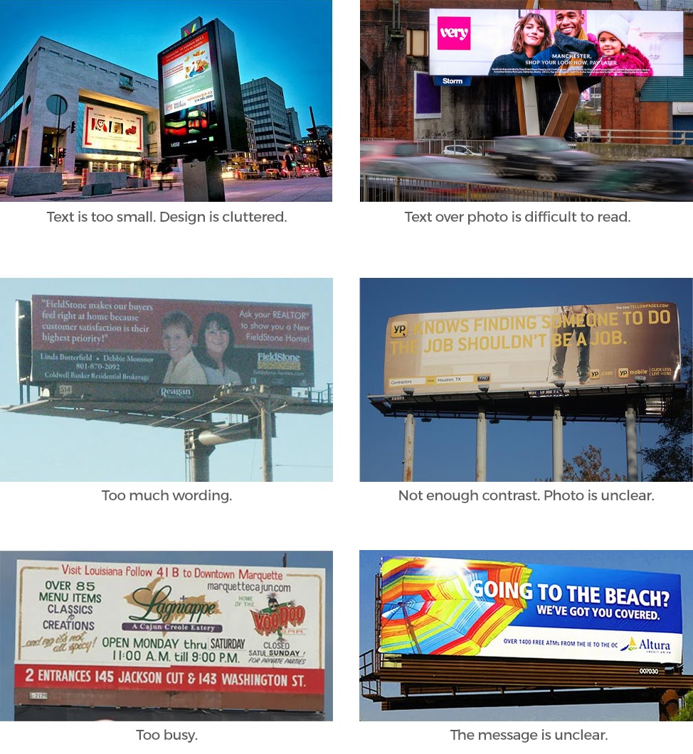
EXAMPLES OF “BAD” OUT OF HOME ADS
If you have any questions about content design or best practices, email us at content@adomni.com or live chat or phone.